NETFLIX SANS
Role: Design & Creative Direction
Foundry: Dalton Maag
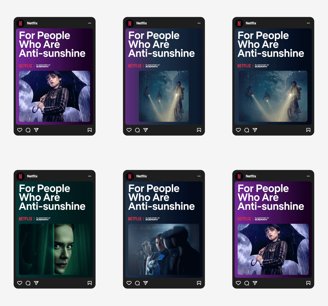
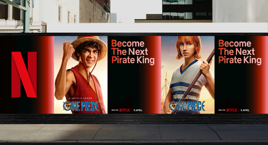
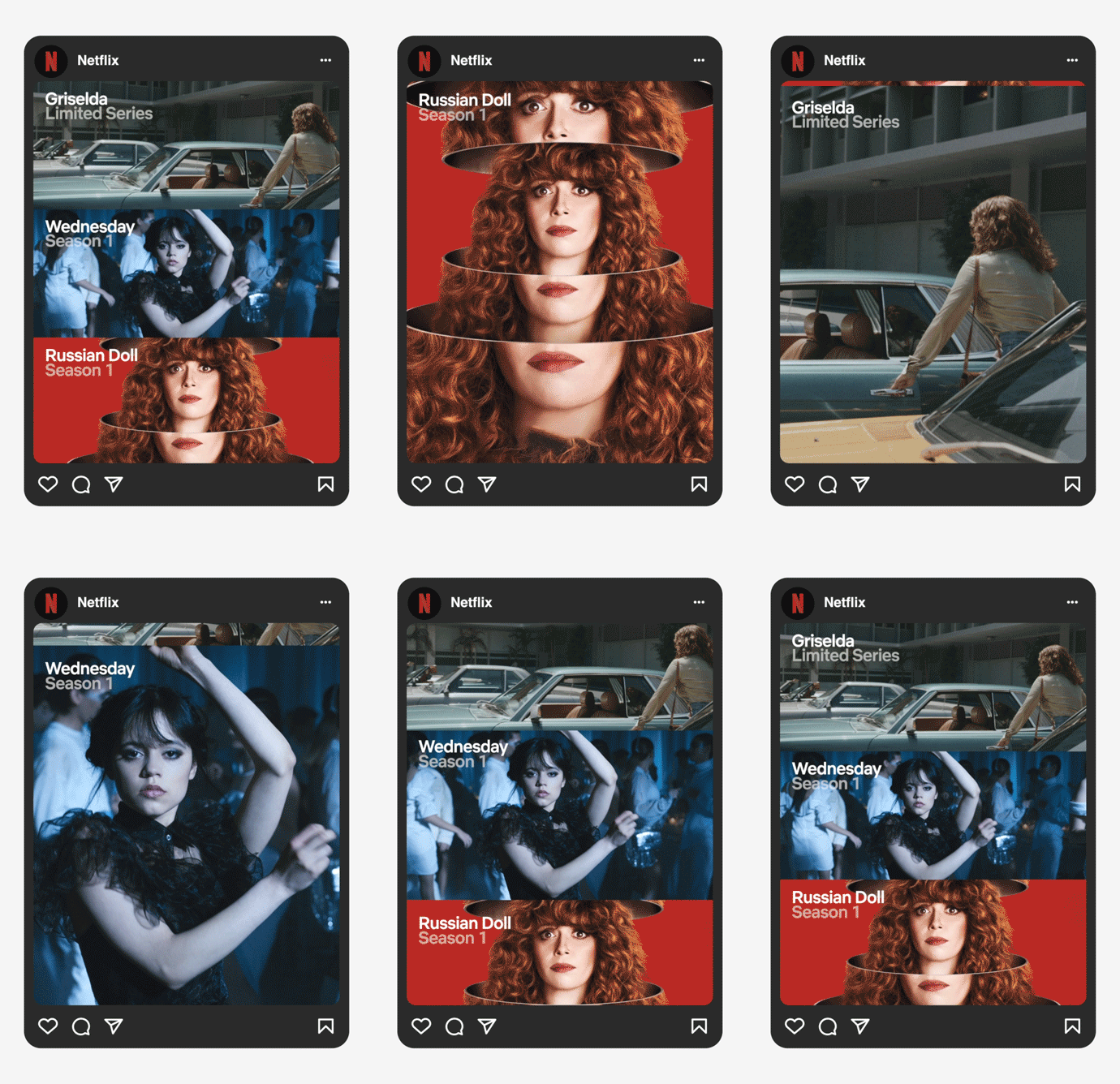
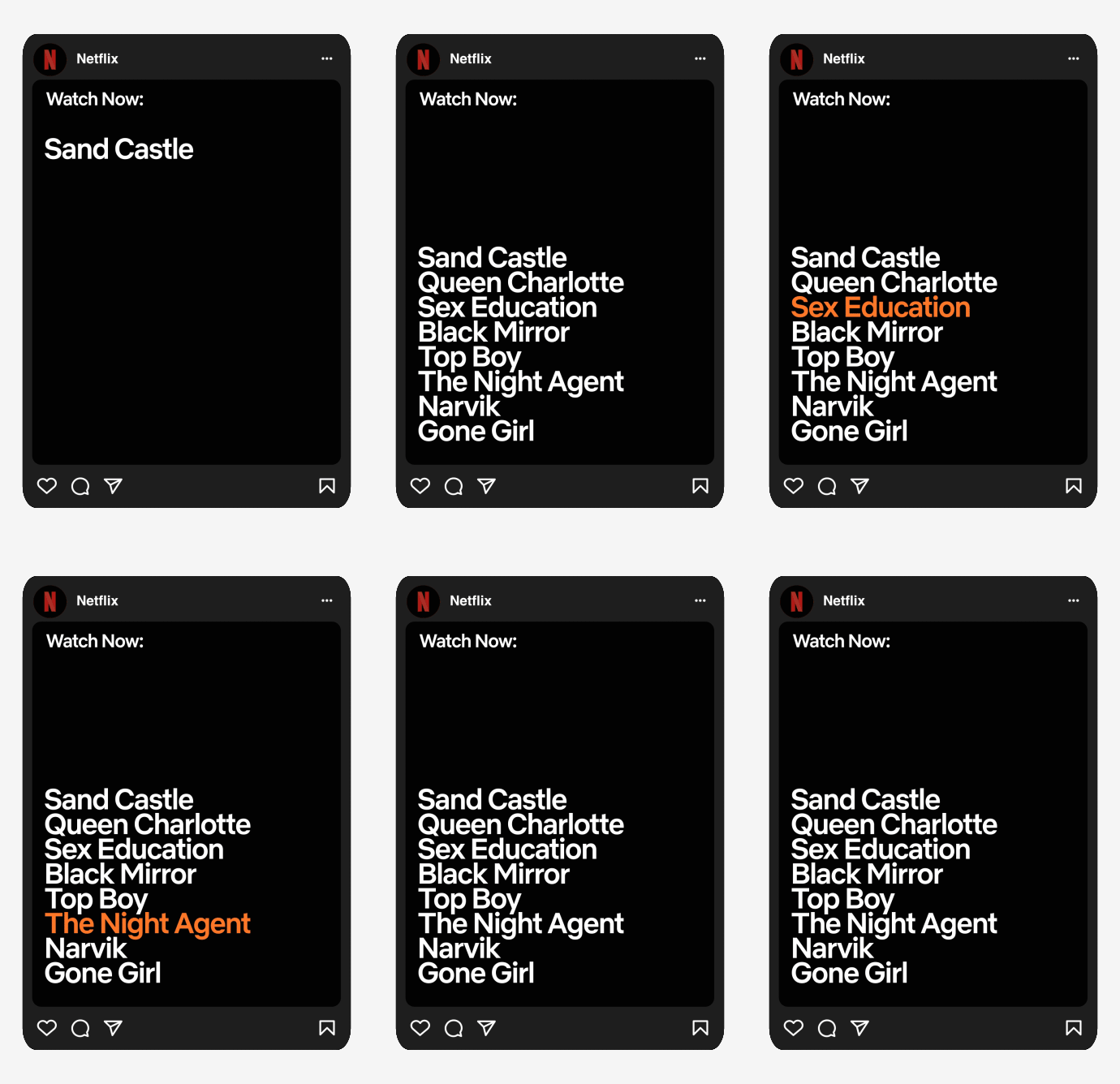
As part of Netflix’s broader effort to build a unified and globally resonant brand identity, Netflix Sans was developed in partnership with Dalton Maag as a bespoke typeface supporting over 120 languages. Designed to be both expressive and highly functional, the type system spans a wide range of weights and widths—providing the flexibility needed to scale across marketing, editorial, and product environments. The typeface brings a cinematic sensibility through refined details, while remaining neutral enough to let content shine. From product UI to global campaigns, Netflix Sans is now a core brand asset—enabling consistency at scale while allowing sub-brands and creative teams the freedom to use it with editorial nuance. By codifying usage across all touchpoints, the system has strengthened brand recognition and delivered long-term operational and creative value.


